
One of the most common tasks when launching a new website is creating a logo. The logo is a more than necessary element for a blog or a website. It is the icon that will symbolically represent your niche. A logo is like your brand’s ambassador – it represents and captures the essence of your business in a single eye-catching image.
Whether it’s a one-page site or a blog with a lot of reading, any website can benefit from a well-designed logo. Let me explain the importance of logo design for a website. Many website owners overlook the value and importance of having a logo for their blog or website. In the blogosphere in particular, where there are several websites on the same niche, the logo is what will remind your visitors of your work. It’s a scientific fact, an image is much easier to remember than any other piece of information.
Depending on your artistic talents, creating a logo can be something you do with your eyes closed, or a source of insomnia. It’s not necessarily about making a logo that is too complicated. If you look at any great website, the first thing you will notice is that they are surprisingly simple for the most part.
Best practices for making a logo for your website

Before you head first into creating your perfect logo, let’s start with the basics. There are key principles to follow when designing your logo.
Good logos respect this:
They are beautiful, in both small and large format.
Whether on a billboard, a business card or on a letterhead, the logo is easy to find. It can resize for any media, from a small favicon to a giant poster.
They are beautiful, in color as in black and white.
Even if the DMTwebhosting logo is in color, would you recognize it if it was in black and white? This is the key. If color is crucial, then think twice. You may find yourself in a situation where it has to be monochrome.
They are recognizable even without words.
As for the first point, these logos stand out, without adding words. There may be a version with words, but the logo can do without it. The form says enough.
They are simple.
Don’t make an overly elaborate logo. If an 8 year old can easily draw your logo, you have won.
They will not go out of fashion.
If all goes well, your business will live for several decades, so do not choose a design based on a trend or a fashion. Your logo should look good no matter what is in vogue.
They must match your niche.
Your logo is supposed to be a visual representation of your business. So naturally, your design should match your industry and the type of business you have. For example, if you need a logo for a hosting company, use professional colors and fonts for this type of business. It will make your logo look more “natural” to your customers.
Keep these basic principles in mind when choosing colors for your logo and you will create a gap with the competition.
It’s not that complicated, is it? You can absolutely do it!
A color combination that works
Don’t use a color just because you like it. In addition to the aesthetic value, remember that the logo should follow the theme of your blog. Be sure to use not only the right color, but also the right shadows. Otherwise, it can appear as an intruder, or as I said, uncoordinated.
There are bloggers who do the opposite: they start with the logo and then create their blog. I imagine that it gives more freedom when designing the logo. But of course, if that’s the case, then you have to pay attention to the theme to choose for the blog.
Good typography
Website logos are usually symbol and text style, as they often serve as a header image. This is why you will need a beautiful font that stands out. Of course, the type of font that will suit will vary depending on the niche of your blog (personal blogs tend to have more artistic font, while professional blogs tend to opt for bold and simpler fonts) and to your personal preferences. We recommend avoiding complicated fonts like Grunge or macabre options unless it is really the image you want to give.
Here are some important tips for choosing the right font for your website logo:
Choose minimalist fonts. Your logo should be legible even when it is minimized.
You have to focus on your niche.
Do not use more than two fonts. Make sure your fonts go well together.
Choose a font that will stay current over the years.
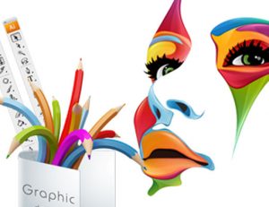
How to create a logo
![]()
So now that we’re done with the reasons and the basics of logo design, it’s time to get to the heart of the matter – making the logo itself.
There are several ways to create a logo, depending on your time and budget:
To have a unique logo, you can use the services of a designer or a design studio.
Otherwise, you can follow our guidelines and create a logo yourself.
You can also use an online logo generator. It’s a great way to create a good logo without investing a lot of money. On some platforms, you can even download a small logo (perfect for a website or blog) for free.